Designing The Unreasonable Playbook
When Khosla Ventures needed a playbook for founders built around sixty principles from Vinod Khosla, Design Partner Michael Gough reached out to see if we could help. He was working with founders to bring design thinking into the earliest stages of company building, helping teams navigate uncertainty and build products people actually enjoy using. At the same time, he was working closely with Vinod Khosla on a synthesis of the principles behind decades of working with founders.
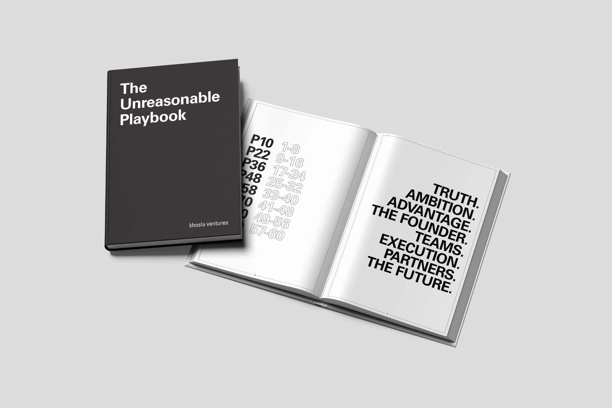
Sixty principles. One book. And a fixed deadline. It needed to be in founders’ hands at Khosla’s annual CEO Summit, an invitation-only gathering of portfolio founders and leaders focused on everything from AI and deep tech to the realities of scaling ambitious companies.
We had six weeks.
As soon as I understood the scope, the ambition of the content, and the timeline, I knew exactly who to bring in. Anthony Wiktor and I have been working together for nearly twenty years. That history means shared taste, shared instincts, and a level of trust that removes a lot of friction. We can make decisions quickly and know we’re aligned.
Anthony also has a design aesthetic I genuinely believe is singular. His work is precise without being rigid, considered without tipping into decoration. He focuses on what a project actually needs and moves fast without losing his judgment.
Within a few days, we had translated the content and creative directions into several different layout structures and design aesthetics, each was grounded in it’s own unique story and point of view.
We ultimately landed on the field guide concept, and from that point on it was all hands on deck.
Built to Be Used
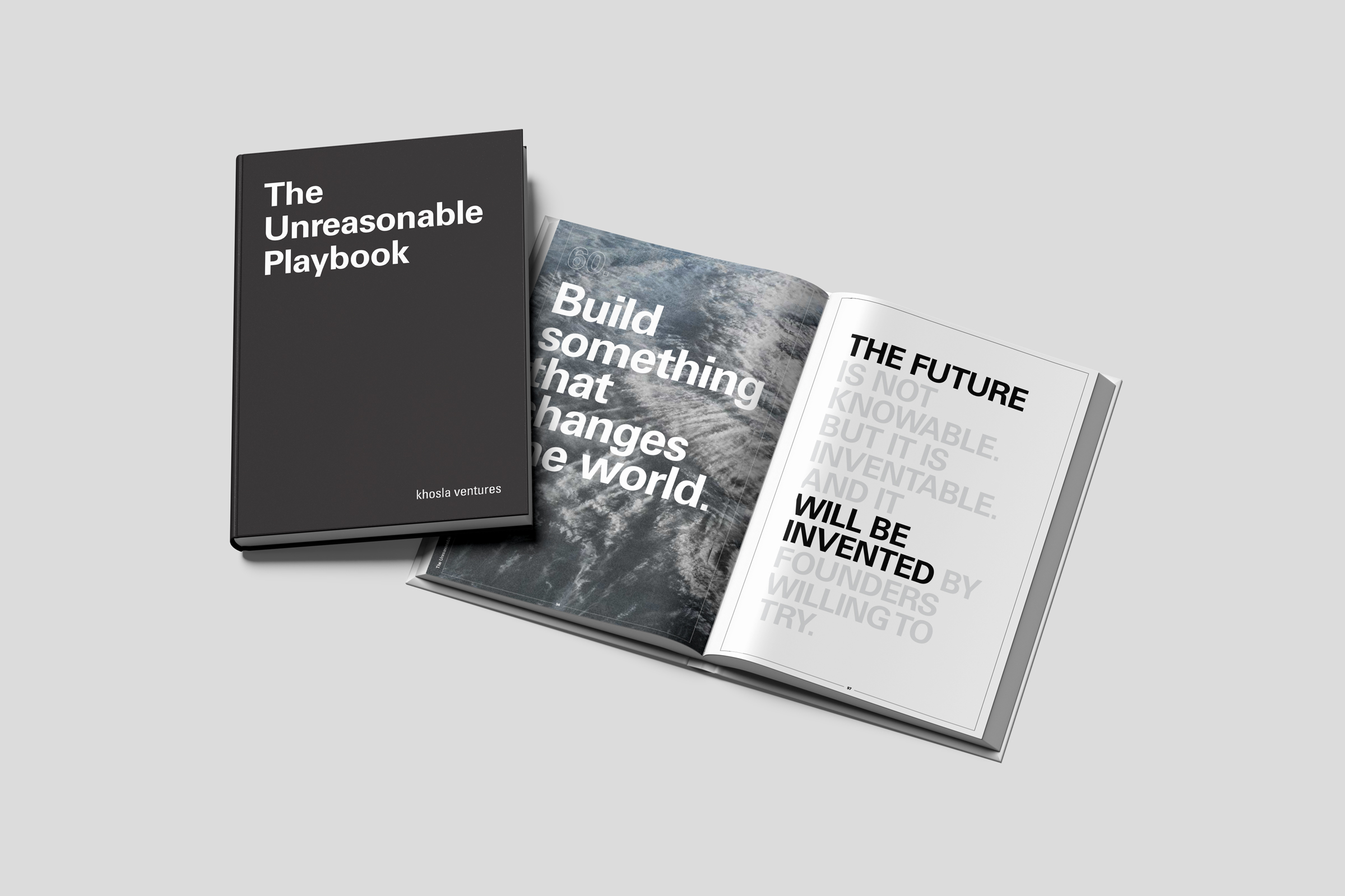
From the start, the field guide concept was less about aesthetics and more about intent. Field guides don't live on shelves. They get written in, folded, and returned to. They feel like yours after the first read.
So the white space was built deliberately. Generous margins, room to breathe, openness that invites note taking.
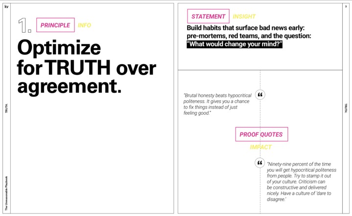
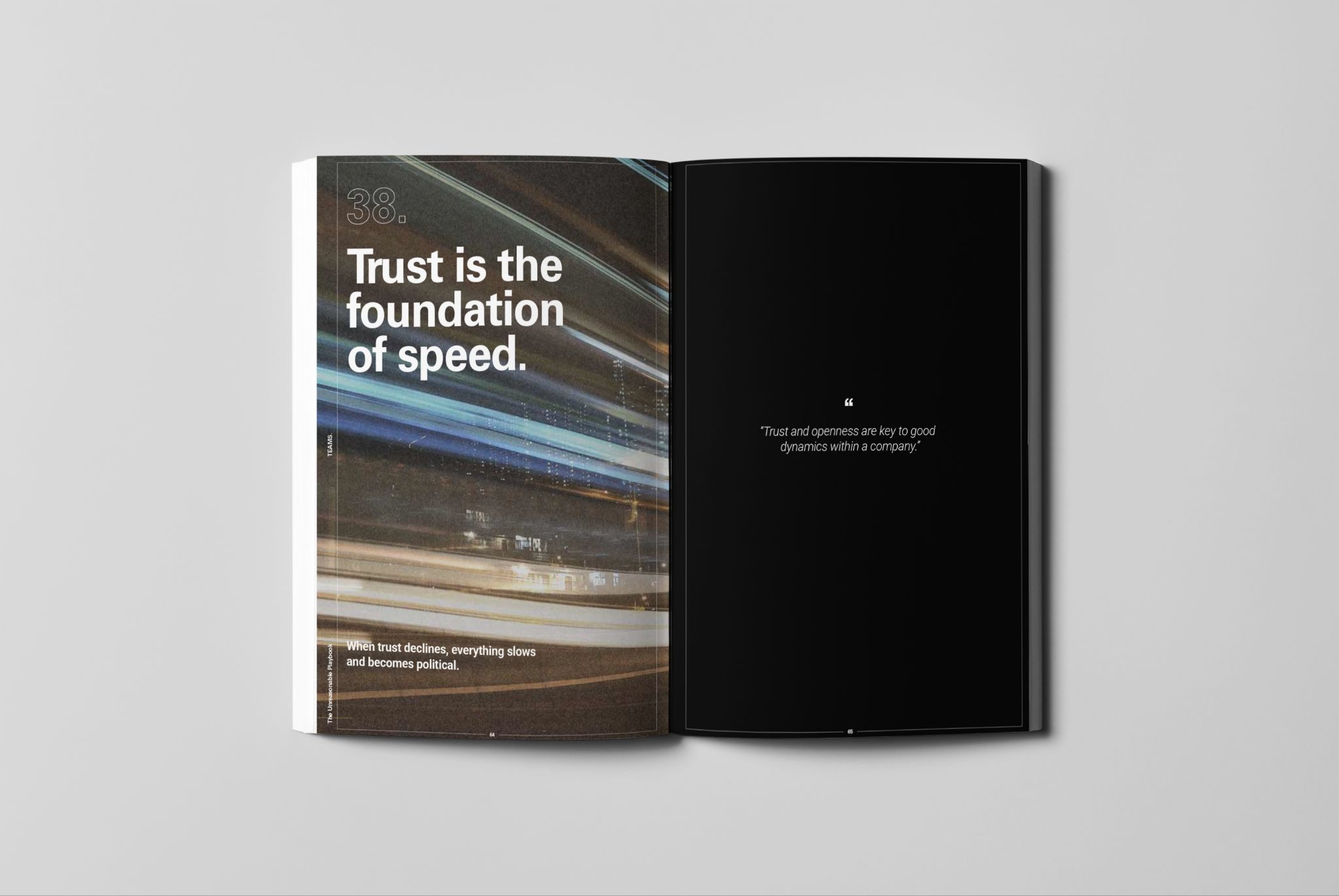
The design challenge from there was carrying sixty distinct ideas without feeling repetitive. Our approach was to leverage contrast. Each principle gets its own page, direct and prominent, while supporting content lives alongside it with more room to move.
Typefaces were Univers LT Pro Bold and Roboto, both suggested by Michael. Univers brings structure and authority at display scale. Roboto handles the longer text cleanly without approachability. Neither one competes with the content or each other. They allow for a clean hierarchy and impact.
Thin framing lines run throughout, a nod to the field guide tradition. Clear and purposeful without tipping into overly decorative. They make the white space feel chosen rather than empty.
Full black spreads hit at key moments, not for decoration but to shift the pacing and give certain principles the weight they've earned. Some ideas arrive quietly. Some will land harder.
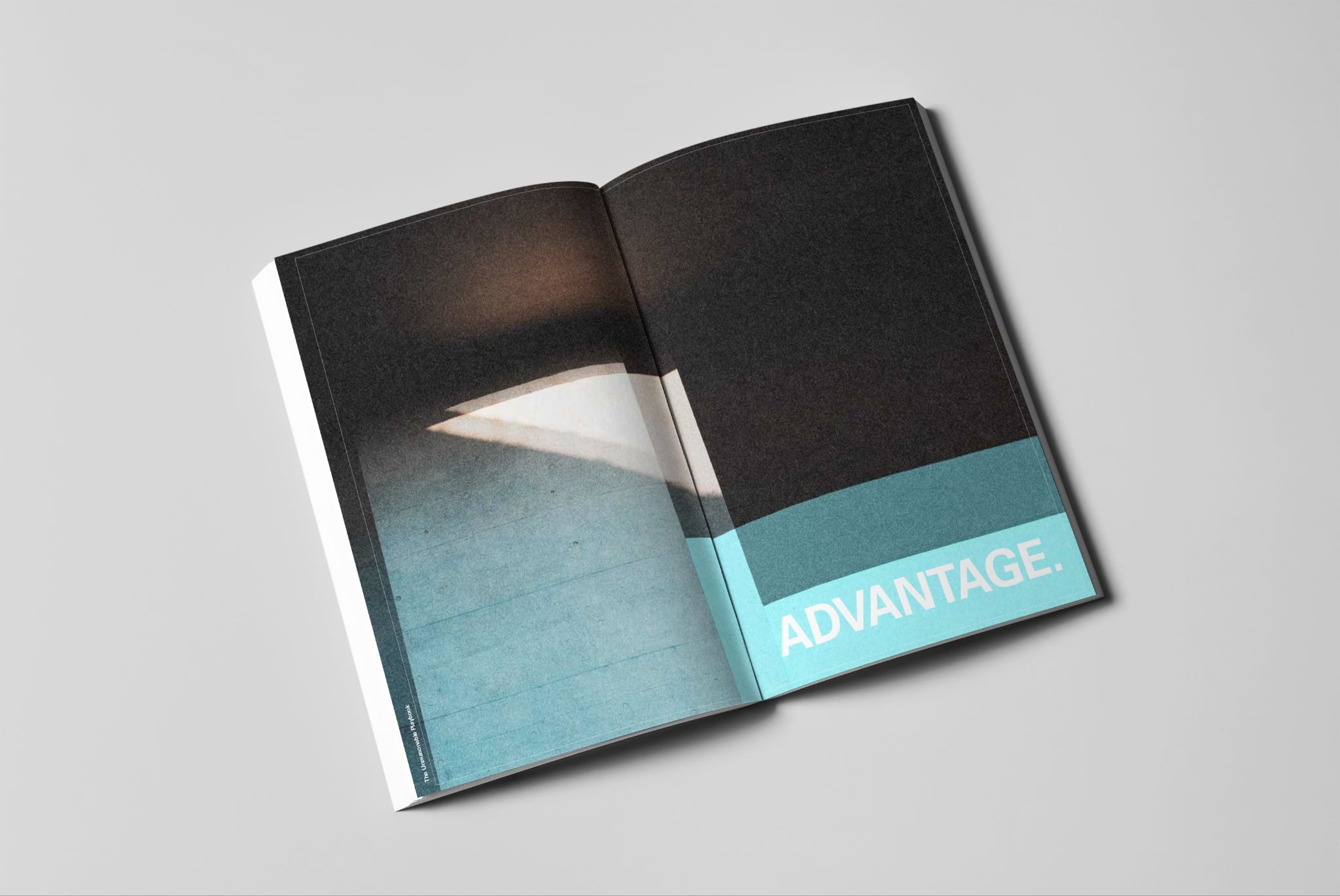
Imagery as Atmosphere, Not Illustration
The photography isn't there to explain the content. It's there to create space around it.
We chose images that feel expansive and slightly unresolved. Earth from orbit. Snow-covered mountains. Water moving across rock. Moments that suggest scale without being literal. Nothing that points at a chapter and says "this is what this means." The content does that on its own.
We cropped and treated each image to lean more abstract, closer to texture than subject. Distressed enough to feel less like photography and more like atmosphere. The goal was to give the reader a pause between ideas, a moment to reset before moving on. Something that registers without demanding to be interpreted.
It also tied back to something we kept coming back to throughout the project. These principles are about thinking at scale, about building things that matter and sitting with the weight of that. The imagery needed to carry some of that feeling without spelling it out. Vast without being decorative. Considered without being precious.
Paper, Production and Print
We stayed close to every step of the print production, from the first proof through final assembly. Paper choice mattered. We wanted something tactile and durable that would hold up to real use, not something that looked good under glass.
We landed on Eggshell Superfine 130# for the cover and Superfine Text 80# for the interior. Both have a slight texture that takes ink well and feels good in your hands. The kind of stock that looks better after a year on a desk than it did coming out of the box
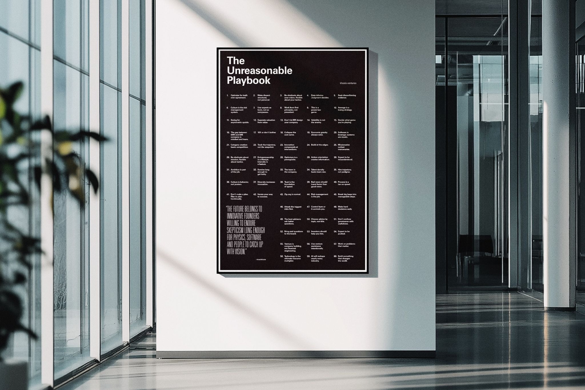
The Poster
We also designed an 18" x 27" poster that folds down to fit inside the book. The fold is part of the experience. Folded, the poster presents a single Vinod Khosla quote as its cover, functioning as a kind of seal: something to read before you open it. Unfold it, and the full poster reveals itself, with the quote now anchored in the lower left corner, present but no longer dominant.
It's designed to come out of the book and live on a wall, and to feel just as intentional there as it did in your hands.
What We Hoped to Make
Design gets framed as problem solving. Or communication. Both of those things were true on this project. But neither one fully captures what we were going for.
The real goal was straightforward: make something a founder actually reaches for. Not pulls off the shelf for guests. Something they pick up on a hard day, flip open at random, and get something real from. A book that earns its place on the desk by being useful, not by looking good sitting there.
Vinod's principles are the kind of thing that hits differently at different stages. Something you read early on lands one way. You come back two years in, mid-pivot, and it means something else entirely. We wanted the dog-ears and the notes in margins. Those are signs the book is doing its job.
The Unreasonable Playbook was written by Vinod Khosla and edited by Michael Gough with support from Olga Chumanskaya, Justine Sink and Ryan Todd. Designed by David Sperry and Anthony Wiktor.